Responsive Design

Initially, there were websites designed for different devices, and would cater to different users. But there’s been a shift. It is now possible to have a site that is equally favourable for both desktop as well as mobile users. And this can be achieved with a responsive web design.
With an increasing number of mobile devices such as smartphones and tablets, we now use our phones to access the Internet, browse social media outlets, check mails or even shop online. Keeping this in mind, it’s extremely important to have a website that is mobile friendly.
What is Responsive Design?
One of the most appealing aspects of a responsive design is that it can make one website accessible to many users on their choice of device and screen size. Here, the website is like water and the device is like a glass. -When a user opens your website, it will spread itself gently across the screen of the device to accommodate for resolution, image size and scripting abilities.
What we offer
We, for one, will ensure that your users get the best experience. And two, that you’re ahead of your competition.
For this we will bring together our bandwagon of designers and developers who will evaluate and accordingly, create the responsive design for your website. You might want to either redesign your current website or create a new one altogether. Based on your requirement, our team will first design wireframe layouts keeping mobile as the centre of our strategy. We will then scale up and build the tablet and desktop designs.
Building basic wireframes is an important process as it makes it easier to plan the route a user should take when he/she visits your website. A wireframe is very useful to determine how a user interacts with the interface.
Once we get a green signal from you on the wireframe and page elements, we will then go ahead and start designing the website using Photoshop. Before that, our team will define a visual language for the brand by composing a style tile. Here, you will be presented with interface choices consisting of fonts, colours and interface elements that will communicate the essence of your brand on the web.
The final stage will include developing the website using HTML and CSS. Our team will focus on precise coding, optimizing images and photographs, and testing template components.
All along, our aim is to make sure our designs are paving the way for a long-lasting user experience on your website.
Recent projects
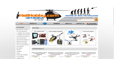
Helihobby
We grow businesses through custom web design and digital marketing plans.
 View Project
 View Website
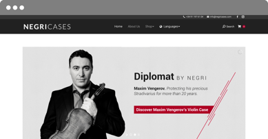
Negricases
Expand to become a trustworthy and highly recognized name in the music industry.